
I decided to use the same font as I used on the digipack cover, as to relate both advertisements together, and to create more of an image for the artist, when they see this text on anything, they will relate it to the artist and their music.
having the artist at the left side of advert, using the "Z" rule of advertising, will make sure that the target audience sees the artist first, and will relate the text, which is next to him to the adverts purpose. Having the text smaller than the artist, will make sure that the audience gets drawn in from the image, and then be led to read the text, reading the larger text first, and then working down when they get drawn in.
If this advert was to be placed inside of a well known magazine, I would probably choose a magazine such as "Acoustic guitar" or " Performing Songwriter"

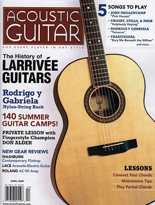
These magazines would be appropriate because they are particularly specialist magazines for musicians, focusing on certain areas of music that my artist belongs to, therefore, my target audience would read these magazines and, seeing my advert, would be attracted to it as it will relate to what they are looking for within the magazine.
The "Z" rule, is the idea that audiences read an advert in a Z, working from left to right, down and then left to right again.
I will show this to a few of my target audience, and get them to post feedback.
No comments:
Post a Comment