This is my finished evaluation for my project, created using the combination of Prezi and Video footage.
Wednesday 21 March 2012
Tuesday 6 March 2012
Focus Group + Analysis
Upon completion of my video, I decided to display it to a selection of my target audience, in order to receive some feedback, this is the video footage:
Focus Group from Sam High on Vimeo.
Some of the main points from my feedback are:
Focus Group from Sam High on Vimeo.
Some of the main points from my feedback are:
- The response was generally positive, commenting on that the song fits well with the video, that it was enjoyable to watch, and that it highlights the artists and presents him well.
- From the video It was pointed out that some of the lip syncing was not fitting very well, so that is a point to improve.
- It was also said that the narrative would be more enjoyable if it had different locations and/or a female character.
After watching the video and receiving feedback, I shall do my best to edit the video and make the necessary changes. I will also show the video to more specific members of my target audience, to obtain more feedback and see if it meets my criteria to please them.
After redoing the lip sync in the video, I gathered some feedback from more specific members of my target audience, and they said that it gave it a bit more realism and considered it better than the previous version, how ever in relation to changes in the plot (additon of a female character, changes in narrative etc) due to the time frame I will not be able to add these, however, in my evaluation I will include an explanation of what I would do with these features if I did indeed have more time to add them.
After redoing the lip sync in the video, I gathered some feedback from more specific members of my target audience, and they said that it gave it a bit more realism and considered it better than the previous version, how ever in relation to changes in the plot (additon of a female character, changes in narrative etc) due to the time frame I will not be able to add these, however, in my evaluation I will include an explanation of what I would do with these features if I did indeed have more time to add them.
Thursday 23 February 2012
Final Magazine Advert
Following the response I had to my previous Ideas for a magazine advert, I decided to go out and retake the image, and redo the text, for a better advert, this is the finished image:


I decided to use the same font as I used on the digipack cover, as to relate both advertisements together, and to create more of an image for the artist, when they see this text on anything, they will relate it to the artist and their music.
having the artist at the left side of advert, using the "Z" rule of advertising, will make sure that the target audience sees the artist first, and will relate the text, which is next to him to the adverts purpose. Having the text smaller than the artist, will make sure that the audience gets drawn in from the image, and then be led to read the text, reading the larger text first, and then working down when they get drawn in.
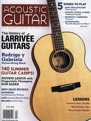
If this advert was to be placed inside of a well known magazine, I would probably choose a magazine such as "Acoustic guitar" or " Performing Songwriter"
These magazines would be appropriate because they are particularly specialist magazines for musicians, focusing on certain areas of music that my artist belongs to, therefore, my target audience would read these magazines and, seeing my advert, would be attracted to it as it will relate to what they are looking for within the magazine.
The "Z" rule, is the idea that audiences read an advert in a Z, working from left to right, down and then left to right again.
I will show this to a few of my target audience, and get them to post feedback.
Tuesday 21 February 2012
Completion of Music Video
Recently I accumulated all the necessary footage, and edited it together into my finished music video.
The video is the total length of 4:52 and features the narrative of, for the first half, the artist performing the song, singing and playing guitar, and the second half the artist performing the song whilst walking alone.
I uploaded the video to Vimeo, and it can be viewed underneath:
The video is the total length of 4:52 and features the narrative of, for the first half, the artist performing the song, singing and playing guitar, and the second half the artist performing the song whilst walking alone.
I uploaded the video to Vimeo, and it can be viewed underneath:
Caught Off Guard - Music Video from Sam High on Vimeo.
Thursday 2 February 2012
Change in Music Video Concept
Due to a number of unavoidable reasons and clashes, I have been forced to change to narrative of my music video. The video will no longer feature the storyline of the "Boy meets girl" scenario, and as a result, I will be giving the video a more performance based narrative, featuring more conceptual ideas, focusing mainly on landscape and scenery. The video will adapt a closer approach to the artist, detailing, and introducing him more, and focusing on him and his image.
Tuesday 24 January 2012
Possible Promotional Strategies
Being a small artist just starting out, promotional strategies must support the amount of funding you have (that will most likely be a smaller amount) as well as being as effective as you can make them, some of these may be:
• Allowing your music to be purchased and downloaded online
• Doing various gigs and shows around the local area, to aquire an audience
• Promotion via social networking sites, e.g Facebook, Twitter, Youtube.
• Posters in windows of small record shops
Some of these are more doable than others, though all would give the desired effect, the question would be which of the would be the most cost effective.
Wednesday 18 January 2012
Adding Text to the Adverts
As well as taking initial photos, I decided to play around with the text that will accompany them.
A majority of Magazine Adverts are quite simple, and while only containing small amounts of text, make sure that it describes and sells the product effectively, and grasps the audiences attention. For most adverts, there are key features which it must describe, these are:
 This is one design I have tried, and added text to, what I think was one of the most effective body shots. It simply features all the necessary information (Artists name, album name etc) In a white font that resembles what I have used on the digi-pack cover, as to keep continuity between the artists products and adverts. The text keeps quite big near the top, as to grab the audiences attention with the most important information. In the bottom corners of the advert are the artists various websites, being very small, if the reader has been interested in both the image, and the text, they will read down to see where they can find out more information about the artists.
I am aware that in this particular advert, the writing is quite difficult to read, and I find this to be a fault with the background, as this is only an initial design, I will look to take this image again, using a different, possible more neutral background.
 Here, I have added text to again, what I think is the best side shot. The text keeps to the same conventions as the previous design, yet, while being easier to read, includes two quotes, from things that have been said about the artist. These help, not only to further entice the audience that the artist is good and upcoming, but also that others, possibly even well known people, have seen or listened to this artists music and like it, persuading the audience to listen for themselves. Again, I feel this is not the best shot I can possibly get, and so will search for better locations.
A majority of Magazine Adverts are quite simple, and while only containing small amounts of text, make sure that it describes and sells the product effectively, and grasps the audiences attention. For most adverts, there are key features which it must describe, these are:
- Artists name
- Name of Album
- Single which the album contains
- Release date

I am aware that in this particular advert, the writing is quite difficult to read, and I find this to be a fault with the background, as this is only an initial design, I will look to take this image again, using a different, possible more neutral background.

Initial Advert Designs
In order to get a feel for what I'd like the advert to look like, I have taken some photos close to the images I have previously described:
I find the body shot photos quite effective, as they give a reflective, pensive attitude to the image, and the audience is forced to focus on the artist, and could spark the question: "What is he thinking?". it also represents a lot of emotion, which in turn could tell the audience that his songs are filled with emotion. The orange background also makes for a eye-catching image, and as they are leaves, it signifies the time of year, prompting the audience to relate even more. The fourth photo is a shot with simply just the body and bottom half of the head, whilst still being similar to it's predecessors, seems to draw the attention to the artist even more. Not only does he take up more of the frame, it draws more attention, as it adds a small sense of mystery, as the audience cannot see the entire artist.
The last two are side shots, with scenery in the background. As the artist is looking into the distance, it still keeps with the pensive, contemplative theme of the advert, as to allow the audience to want to understand the artists, possibly complex mind, and his emotions, which they could assume are portrayed through his music. I feel there's not enough of the artist in these shots, and should involve less of the scenery, as I feel it subtracts attention from the artist a little. Also, as these are only initial photos, I could consider changing the location, as to give a more suitable view to suit with the theme of the advert.
Thursday 12 January 2012
Image for Magazine Advertisement
The image for a magazine advertisement has to be both eye catching and aesthetically pleasing to the target audience, in order for it to grab their attention and pursuade them to buy it.
I have decided to use a photo of the artist for the advertisement, as this would be what would attract the audience the most, though a key feature of the advert is what this photo would look like:
 This image is one idea of what I would want it to look like. The pose is the artist simply looking down. This could be effective as it portays a good deal about the artist: that he may be shy, nervous and quirky, a figure that males can relate to and females may find attractive, therefore drawing their attention to it. It is also very simplistic, as the artist take up a majority of the image, it focuses the audiences attention on him.
 This is another possibility for the advert. This one features the artist leaning up against a wall and looking directly at the camera. This is a much more maculine photo, and possibly features a strong sex appeal to women, and a role model for men. The fact the pose is looking directly at the camera, instantly creates a connection with the audience, allowing them to relate themselves not just to the photo, but to the advert, as it implies that the advert is directed and addressing them.
This particular photo may also be effective black and white, as to compliment the digipack cover:
Though this may be too similar and result in too much use of black and white.

I have decided to use a photo of the artist for the advertisement, as this would be what would attract the audience the most, though a key feature of the advert is what this photo would look like:
This particular photo may also be effective black and white, as to compliment the digipack cover:
Though this may be too similar and result in too much use of black and white.
Thursday 5 January 2012
Digipack Cover Design Ideas
Using Fireworks on Windows, and following up from the feedback I recieve for my Photo Ideas, I decided to build on the image and start adding text and finalsing the Digipack cover.
I've decided to name the digipack "Things Left Unsaid" as I think this fits with the theme of the song I am producing the video for, and further songs that would appear on the album. Based on my target audience, artists that are similar to me name not only their songs, but their albums after emotions and relationships, and therefore it would be more appropriate to name my album "Things Left Unsaid" instead of my previous idea, "Cityscapes"
 This is one of the ideas for my Digipack cover. It has a dark and mysterious feel which relates well to the title and it's theme, memories and regrets. By keeping the colours black and white it gives a very simplistic effect, but also manages to highlight the key features of the cover. I chose to keep the text white, and it contrasts well with predominantly dark, and the font gives an errie effect, which again, compliments the theme.
 This one is very similar, although with a different and more simple font.
 This one is the coloured version of the image. It brings to life the image, stripping away it's simplicity and replacing it with more depth. The font is different also, And I think this one may be the most effective, as it is quite simplistic, but also contains a flare with give the image of a professional musicians signature font.
 This is a combination of both, using the sketched image, with the better font. In comparison to the first idea that uses this image, the font is more understandable, and adds an even more simplistic feel towards the image.
I will send these to a group of my target audience, and give their opinions on my ideas.
Edit: From the audience response I received, they said that they do prefer the last one, as it has "A unique effect" and "would portray the digipack effectively". Though they also said that the color one would be just as good at "Bringing it to life"and contains more detail.
In conclusion I will go with the black and white option, as this seems to be the one that pleases the audience more.
I've decided to name the digipack "Things Left Unsaid" as I think this fits with the theme of the song I am producing the video for, and further songs that would appear on the album. Based on my target audience, artists that are similar to me name not only their songs, but their albums after emotions and relationships, and therefore it would be more appropriate to name my album "Things Left Unsaid" instead of my previous idea, "Cityscapes"


I will send these to a group of my target audience, and give their opinions on my ideas.
Edit: From the audience response I received, they said that they do prefer the last one, as it has "A unique effect" and "would portray the digipack effectively". Though they also said that the color one would be just as good at "Bringing it to life"and contains more detail.
In conclusion I will go with the black and white option, as this seems to be the one that pleases the audience more.
Tuesday 3 January 2012
Magazine Advert Deconstruction
There are many different forms and ways to layout an advertisement for a product within a magazine, and adverts for Digi-packs and CDs are no exception. They can range from very extravagant and eye catching aesthetics, to simple and to the point connotations.
 This is an advert for Cee Lo Green's album "The Lady Killer". the top half is a picture of the artist himself, while underneath, in his signature font, the artists' name and album title, followed by the date of the album release and the single.
whilst being very simple, there are many signifier it could include. The fact the majority of the advert is a picture of the artist examples that his image is clearly very important, and that a majority of his target audience must appeal to his looks. It could also, simply be to attract possible audiences who may recognise him from various other publicity he has done for this album.
The artists name is written in pink, this could further show that it is directed at possibly a female audience, and also that this advert could be part of quite a feminine magazine, as pink writing is not something that is common within male magazines. The smaller writing at the bottom tells the audience that it includes the "No.1 single" and underneath that, says "The greatest male voice in US soul "Sunday times"". This shows significance, as once the audience has been drawn in by the picture and the artist, it then goes on to say how good and popular both the artist and the album is, therefore further persuading the audience to buy it. Right at the bottom in the smallest writing, there is the artists website and his record label, once the audience has read the rest of the advert, if they are an avid fan or wishing to know more about the artist, they can take note of this information, whereas otherwise, it is too small for someone who is just skimming over the advert, and may not be noticed as easily.
This advertisement was found in Rolling Stones, an accomplished music magazine, and is promoting Morrisey's "Years of Refusal. It features a picture of Morrisey holding a baby, with his name, and album title behind him. This advert was found in the bottom right corner of a page and is quite small, therefore it must be aimed at specific fans of the artist that will easily recognise him and pay attention to even the smallest of appearances. Both the writing and Morrissey's shirt are in a light blue colour, this usually signifies innocence and serenity, and the fact he is holding a baby could be used to attract a female audience that may believe him to be a good family figure, though the fact he is standing with his chest out, in quite a triumphant, macho pose may be a contrast to this. On either side of his is information relating to the album, such as "Out now" and "Featuring "I'm throwing my arms around Paris"" This is quite short and again, may relate to his quite specific audience, reminding them the album has been release, and a popular song that it contains. Again, as the very bottom of the advert in a very small writing, there is the artists website and record label on the left, and an exhibitor of the album "Best buy" on the right. This straight away tells the audience where they can purchase this album from, and also persuades them to go to this specific shop, as it may be at the best price, aswell as increasing reputation for the shop.
Monday 2 January 2012
Ancillary Product Two - Magazine Advertisement
For my second Ancillary product, I am going to be producing a magazine advertisement to promote my
Digi-pack.
The purpose of a magazine advertisement is to promote a product, in this case, the Digi-pack and it's artist and usually contains a number of key features, such as:
Digi-pack.
The purpose of a magazine advertisement is to promote a product, in this case, the Digi-pack and it's artist and usually contains a number of key features, such as:
- A picture of the artist, and the product
- Information about the product
- Catchy images and colour schemes to attract the customers
- Large bold writing to again, attract attention to the advert.
It also must include various information about the Digi-pack, for example:
- Release date
- When/where it is available
- What the content of the Digi-pack is/what it contains.
The aesthetics of the advert also have to be very pleasing and appealing to the target audience, as to encourage them to buy the product, as well as the magazine. This is usually done by combining large bold writing, often in an appealing font, with pictures that stand out, normally of the artist, very large and significant.
Thursday 29 December 2011
Style Models for the Actors
Very shortly I should be filming some parts of my music video.
Due to difficulties in finding a suitable and available actress has led me to postpone all filming that requires her, though I am still searching for someone, and will make sure to film the remaining parts asap.
The two actors within the film will be myself, and the unfound actress. The costumes and style of both will be quite casual, as to keep a relatable feel to the video, though the following pictures will act as guidelines to these:

The female style is very wintery, with features such as a large coat, scarf and possibly a beret. These must also be kept quite trendy as for the audience to relate to, as they may possible own these items of clothing, and will allow them to imitate the actress within the video.
 These two pictures are what I am basing my style on.
<-- This picture is what I would wear for the scenes within the park. Sweater and, even though not within this picture, skinny jeans. This is very casual, and should give a nice contrast to the female style, though both keeping to the same lines, will example the male/female style differences within winter.
This picture is a representation of my style in the evening scenes. Trench-coat, with a t shirt and cardigan underneath. This is slightly more formal, as the entire scene is to give a contrast of loneliness, darkness and mystery to the warmth and emotion of the other scenes.

Due to difficulties in finding a suitable and available actress has led me to postpone all filming that requires her, though I am still searching for someone, and will make sure to film the remaining parts asap.
The two actors within the film will be myself, and the unfound actress. The costumes and style of both will be quite casual, as to keep a relatable feel to the video, though the following pictures will act as guidelines to these:


<-- This picture is what I would wear for the scenes within the park. Sweater and, even though not within this picture, skinny jeans. This is very casual, and should give a nice contrast to the female style, though both keeping to the same lines, will example the male/female style differences within winter.
This picture is a representation of my style in the evening scenes. Trench-coat, with a t shirt and cardigan underneath. This is slightly more formal, as the entire scene is to give a contrast of loneliness, darkness and mystery to the warmth and emotion of the other scenes.

Tuesday 6 December 2011
Dates of Filming/Casting
Now I have the set finalized, the last thing I need to start filming is an actress.
I have yet to cast her, though I plan to ask a few friends if they will be willing to help me out, although there is a certain criteria this actress needs to meet to be an ideal candidate for the video:
I have yet to cast her, though I plan to ask a few friends if they will be willing to help me out, although there is a certain criteria this actress needs to meet to be an ideal candidate for the video:
- Must be pleasing to the eyes of both gender of audience (Attractive to males, relatable to females)
- Brown eyes (So that they reflect the lyrics: "A hazel gaze I have never seen" )
- Flexible, time wise. As filming dates may be subject to change.
Once I have an actress, I can choose a few days for filming, though I plan these to be sometime in the next few weeks, either just before Christmas, or the first week of January.
Though, only half of my filming requires an actress, the other half includes only myself, therefore I can film this whenever time is available. Though, as the footage requires me to be in it, I must call upon the help of a friend to film for me. I have many people I can ask to fulfill this job, the only thing it affects are the filming dates, as I must set them for when they are free, though this should not be too much of a problem.
Though, only half of my filming requires an actress, the other half includes only myself, therefore I can film this whenever time is available. Though, as the footage requires me to be in it, I must call upon the help of a friend to film for me. I have many people I can ask to fulfill this job, the only thing it affects are the filming dates, as I must set them for when they are free, though this should not be too much of a problem.
Saturday 3 December 2011
Change to main set location
So, I have encountered problems with the original location of my set.
I intended it to be a local coffee shop, but, due to corporation restrictions, has made this impossible.
Therefore I have been forced to rethink my location, and have decided to use the gardens at the top of a shopping mall.
This is a much more open location, and the main problem I encounter is that it would be subject to the public. Although this is not completely negative, as it will add a more realistic feel to the video.
Here are some pictures of the intended location:
Wednesday 23 November 2011
Song - V2
In response to the feedback I got from my first recoding of the song I am using: "Caught Off Guard", I decided to re-record it, in an attempt to amplify the vocals, this is what it sounds like:
I shall again see if I can receive some feedback I relation to the production of the song, and see if I can make this the final version.
Tuesday 22 November 2011
SMART Targets - 22/11/11
These are some target I will accomplish in the near future:
- Create a slideshow of location/digipack pictures to show the evolution of them - Thursday.
- Obtain 2 more location photos of the pathway at night time, and turn them black and white - This week.
- Edit song recording to allow more prodominant vocals over the guitar - This week.
Edit: All tasks accomplished - 29th November.
Saturday 19 November 2011
More Set Locations
Here is another slideshow of another set location:
Ideas for use of this location are that the artist is walking along, singing the song, creating contrast to the busy coffee shop scenes, whilst also implementing more performance footage. I plan to film this when it is dark, and add a black and White effect to it, to make it plain, simple, and to give it a noir feel.
This is an example of a similar concept:
"WAITING ON THE WORLD TO CHANGE!!" - JOHN MAYER from Wolde Archer on Vimeo.
A majority of this video features the artist singing while walking , this not only adds a sense of drama to the video, but also a more personal touch, as it can be interpreted either 1. the artist is sharing his inner most thoughts with the audience or 2. he is singing directly to the viewer. I would like to use this concept in my video, especially where the artist is looking directly at the camera, but change the footage to black and white, to add a possibly more darker image, which relates to my song more, but to also increase the artist-veiwer link that this kind of scene creates.
Thursday 17 November 2011
Song Recorded!
I have recently recorded the song I am using for my music video, it is called "Caught up Guard" by Sam High, and I have uploaded it to soundcloud, here is the link.
http://soundcloud.com/sam-high/caught-off-guard
Now having the actually song, it should allow me to put into perspective the production of what I want the video to look like. I shall be uploading more setting photos shortly.
I chose soundcloud to upload my song as it is easily accessible and used by many modern musicians as a simple way for the public to listen to their music. As it is a contemporary website, that has both a Facebook and a twitter, it suits my target audience well, as well as creating easy access for my modern audience.
Examining some feedback I have received, the song is generally well liked, although in production terms, the guitar is too loud over the voice. I will try and adjust the levels in the production to fix the problem, failing this, I may need to re record the song.
Tuesday 15 November 2011
Audience Theory/Research
From the questionnaire I done, I concluded my target audience will be people aged 15-30. A majority of them will be female, though a portion of the audience will likely be male.
The target audience for my video/music would be based of a combination of the influences for the music and image. Artists such as Taylor Swift and John Mayer create music and present an image that is similar to mine, therefore it would be a wise idea to utilize a form of "borrowed interest" and in a sense "borrow" there audience for the purpose of interesting them in my music.
Some key audience theory could also be related to marketing and target audience, for example:
The two-step flow theory - http://en.wikipedia.org/wiki/Two-step_flow
This is the idea that one person informs another, or a group of people of what interests them, and possible influences them on a certain subject. In this case, a fan of the mentioned artists may find out about my music/video and share it with other like minded fans, effectively increasing popularity.
http://connect.taylorswift.com/forum

This is a link to the Taylor Swift forums, in which fans interact and talk to each other about the artist. This is just one of the many ways fans can share their views, express their opinions and introduces fans that like the same genre to other music of a similar style, there is even a specific part of the forum that is dedicated to "Music you like besides Taylor".

This is a good example of how the two step flow is promoted and can be used to an artists advantage.
Tuesday 8 November 2011
Sets for the Music Video
Recently I visited the first set for my music video.
It is a local park, with a very scenic veiw. It will be used as the main place in which the musician will perform the song throughout the video.
Here are some pictures;


It is a local park, with a very scenic veiw. It will be used as the main place in which the musician will perform the song throughout the video.
Here are some pictures;


This is the place in which the artist will be sitting on a bench playing the song throughout the video, this will be a contrast to the black and white shots of the artist walking. Near the end of the video, we will see the female love interest join the artist here while he is playing (Possibly, the artist will sing a portion of the song to her, this is undecided) and the concluding shots will see both the artist and love interest walking off, into the distance, as seen in the top right photo.
Possible problems that could incur with this location are:
- The public: as this is a public place, there is the possiblity that other people could be in the footage, this is not nessarily a problem, although it will be ideal if, when filming, there are no other people about, seeing as a mojority of uses of this park are parent and toddlers, I will try and choose a time to film in which they are not likely to be there.
- Litter: unfortunatly, there may be pieces of litter scatters about, seeing as most of this will be on the floor, I will try and posititon the shots so that the audience does not see the ground.
- Weather: The weather will be quite unpredictably, though looking at a forecast will give me an idea of what it will be like. it would be ideal to filming when it has recently snowed, seeing as these are the wintery months, and the snow will, in turn give the video a wintery feel, though as it is unlikely to snow on the date of filming, I shall not rely to heavily on this.
Friday 28 October 2011
Deconstruction of Music Videos
There are many different types of music video. Some have a story line, some are conceptual, and some are very simple, yet effective. I am going to deconstruct and analyse two music videos which are somewhat close to what I am aiming for in mine: the first is the video for "Comin' Home" by City and Colour.
City & Colour - Comin Home from Alaska Fairweather on Vimeo.
Directed by Chris Sargent, released in 2005, the video features the artist performing the song in a variety of rooms. As well as this, we see a woman and the artist visiting different rooms, but never being in the room at the same time. The whole video is in black and white, which I think contrasts well with the texture of the song, as it is just an acoustic guitar and vocals (which is exactly the style of music I am using) with added solos from an electric guitar. Although being a simple concept, there is a lot of editing within the video, especially in the technique of when the artist is playing, the camera is split, so one side of the screen shows his face, and the other him playing guitar. This is an effect that I could possibly adapt into my own video. The use of fading to either change to a different scene or juxtaposition is utilized quite well, perhaps to give the effect and reflect the means of the lyrics of the song, that things are "fading away". I very much like the intro of the video, where the artist comes in, sits down and starts playing. This is very similar to the concept I have as to the intro of my video, and I may chose to take influence from this, specifically, the use of black and white, and distortion of the lights in the background. The camera is predominantly focused on the artist, with the shots being mainly close ups. Most of the other shots are wide, as to include the entire set when needed. The target audience for this video are possibly a combination of males and females aged 18-30. This could be exampled by the age of the artist, as he is relatable to, and the theme of the song and video: relationships.
Another video that is relevant to the type of video I am wishing to create is "Your Body is a Wonderland" by John Mayer:
The video contains a variety of storylines, which are: the artist, performing the song to a woman, him and the same woman frolicking, and him filming her when outside, the artist writing the song, and him performing live/tour footage. There are a lot of close ups on both the artists and the woman face, and a lot of shots where there faces are together, this details the intimacy of their relationship, possibly allowing some viewers to relate. For a majority of the shots, the background is subject to a partial distorted effect, this helps to keep the audience focused on the two main characters of the video, and make them stand out. Although the screen time of the artist and the woman is seemingly equal, I feel there is more focus on the woman's expressions, which, being very happy and joyful, give the video a very positive and emotive feel, as well as featuring the artist playing the song specifically for her, make this a very romantic video, which, in turn I wish to have as a feeling within my video. Many of the shots and camera angles are very close, which helps encourage the feeling of intimacy between the two characters. The fact the use of home video footage is used also give a unique personal feel to the video. Target audience for this video is practically the same as my first video: Males and females ages 18-30, possibly for the same reasons, Although this video features a much more intimate and romantic theme between the two characters, and the nature of the song suggests it could target teenagers/young adults in relationships.
City & Colour - Comin Home from Alaska Fairweather on Vimeo.
Directed by Chris Sargent, released in 2005, the video features the artist performing the song in a variety of rooms. As well as this, we see a woman and the artist visiting different rooms, but never being in the room at the same time. The whole video is in black and white, which I think contrasts well with the texture of the song, as it is just an acoustic guitar and vocals (which is exactly the style of music I am using) with added solos from an electric guitar. Although being a simple concept, there is a lot of editing within the video, especially in the technique of when the artist is playing, the camera is split, so one side of the screen shows his face, and the other him playing guitar. This is an effect that I could possibly adapt into my own video. The use of fading to either change to a different scene or juxtaposition is utilized quite well, perhaps to give the effect and reflect the means of the lyrics of the song, that things are "fading away". I very much like the intro of the video, where the artist comes in, sits down and starts playing. This is very similar to the concept I have as to the intro of my video, and I may chose to take influence from this, specifically, the use of black and white, and distortion of the lights in the background. The camera is predominantly focused on the artist, with the shots being mainly close ups. Most of the other shots are wide, as to include the entire set when needed. The target audience for this video are possibly a combination of males and females aged 18-30. This could be exampled by the age of the artist, as he is relatable to, and the theme of the song and video: relationships.
Another video that is relevant to the type of video I am wishing to create is "Your Body is a Wonderland" by John Mayer:
John Mayer - Your Body Is A Wonderland from Wut Andeweg on Vimeo.
The video contains a variety of storylines, which are: the artist, performing the song to a woman, him and the same woman frolicking, and him filming her when outside, the artist writing the song, and him performing live/tour footage. There are a lot of close ups on both the artists and the woman face, and a lot of shots where there faces are together, this details the intimacy of their relationship, possibly allowing some viewers to relate. For a majority of the shots, the background is subject to a partial distorted effect, this helps to keep the audience focused on the two main characters of the video, and make them stand out. Although the screen time of the artist and the woman is seemingly equal, I feel there is more focus on the woman's expressions, which, being very happy and joyful, give the video a very positive and emotive feel, as well as featuring the artist playing the song specifically for her, make this a very romantic video, which, in turn I wish to have as a feeling within my video. Many of the shots and camera angles are very close, which helps encourage the feeling of intimacy between the two characters. The fact the use of home video footage is used also give a unique personal feel to the video. Target audience for this video is practically the same as my first video: Males and females ages 18-30, possibly for the same reasons, Although this video features a much more intimate and romantic theme between the two characters, and the nature of the song suggests it could target teenagers/young adults in relationships.
Tuesday 18 October 2011
Questionaire Data Analysis
After recieveing some answers to my questionaire, I gathered the data into a simple tally chart, though simple, it should tell me the information I need to know quickly; This is what I gathered.
Gender: From the collection of people that done my questionaire, it shows that they were mostly male, this could tell me that the genre of music my video is going to be should be directed at males. Although, other research could show that females are actually the predominant audience for my music genre.
Education: Most of my audience are currently in college/A levels.
Music Genre: The biggest music genre my audience seems to like is rock, although the secondary genres were acoustic, pop and rock.
Acoustic versions vs Orignal: There was a tie in votes between yes, the acoustic is better than the orignal, and no preference.
Purchase format: A majority of people put iTunes/Download, so this will possibly effect what format I distribute my video/music through.
Music video concepts: the most popular choice for this was a storyline based music video, which is something I have planned to do. All other choices gained the same amount of votes.
Do music videos influence your purchase: the majority vote in this was yes.
Song Lyrics: the most popular choice for this was Romantic lyrics, with everyday life, although this could be justified with how everyday life could include romance.
Artists / Musicians: John Mayer was the most popular of the musician given, despite how a majority of votes were given to "None of the Above" this could show that many people who done my questionaire are not interested in the musician that influence my music, and this means I possibly need to look for a more specific group of people to draw data from.
What/why music video's appeal: some of the comment I obtained included: They appeal to everyone, narratives follows lyrics, you can relate to the, the convey interesting concepts.
Album Artwork: Photography was the most popular choice, with artwork and sketches being the second. When it comes to designing/create my album cover, I shall take these into consideration.
Social Networking: Facebook and Twitter were the most popular websites people use, with google + haveing more votes than both bebo and myspace.
This is a summary of what I have learned from the Questionnaire, and how it will affect my project:
Gender: From the collection of people that done my questionaire, it shows that they were mostly male, this could tell me that the genre of music my video is going to be should be directed at males. Although, other research could show that females are actually the predominant audience for my music genre.
Education: Most of my audience are currently in college/A levels.
Music Genre: The biggest music genre my audience seems to like is rock, although the secondary genres were acoustic, pop and rock.
People |
Acoustic versions vs Orignal: There was a tie in votes between yes, the acoustic is better than the orignal, and no preference.
Purchase format: A majority of people put iTunes/Download, so this will possibly effect what format I distribute my video/music through.
Music video concepts: the most popular choice for this was a storyline based music video, which is something I have planned to do. All other choices gained the same amount of votes.
|
Do music videos influence your purchase: the majority vote in this was yes.
Song Lyrics: the most popular choice for this was Romantic lyrics, with everyday life, although this could be justified with how everyday life could include romance.
|
Artists / Musicians: John Mayer was the most popular of the musician given, despite how a majority of votes were given to "None of the Above" this could show that many people who done my questionaire are not interested in the musician that influence my music, and this means I possibly need to look for a more specific group of people to draw data from.
What/why music video's appeal: some of the comment I obtained included: They appeal to everyone, narratives follows lyrics, you can relate to the, the convey interesting concepts.
Album Artwork: Photography was the most popular choice, with artwork and sketches being the second. When it comes to designing/create my album cover, I shall take these into consideration.
Social Networking: Facebook and Twitter were the most popular websites people use, with google + haveing more votes than both bebo and myspace.
This is a summary of what I have learned from the Questionnaire, and how it will affect my project:
- Genre wise, my audience likes acoustic versions of songs, and like a pop-rocky type, therefore I can keep to the song I planned on using, also, Romantic lyrics were what people chose in the lyrics question, and my song undoubtedly has these.
- The preferred style of the music video is storyline based, also with footage of the artist performing, and this suits the idea for my video perfectly.
- Most people chose that they download there music off iTunes or some other sort, so I will need to keep this in mind when choosing distribution methods.
- With album artwork, the popular choice was photography, and the idea I have already suits this, though it may be subject to change, if I choose to combine elements of the second choices: artwork and sketches with it.
Tuesday 11 October 2011
Music video research/questionaire
In order to get a more consise idea about my target audience, I have decided to carry out a question with a few questions that should help me gain usuful information.
I have created the questionaire on google documents, and this is it: https://docs.google.com/spreadsheet/viewform?hl=en_US&pli=1&formkey=dFRwdV9QZWhUWldsMkVTM0RHZG16VWc6MQ#gid=0
I will distribute it through various social networking sites and as soon as I have enough reponses, will gather the data and transform it into a more useful form


Ancillary Product One - Digipack Cover
One of my ancillary products will be the cover art for my Digipack, and this could be a variety of things such as photos, art and sketches.
Sometimes album artwork has meaning or a relation to the album title, or the songs within. Although as of yet I still have not finalised a title for my digipack, I have had an idea for the cover:

This photo is quite simple, yet portrays a very realistic interpretation of what the album contains, and what the songs are about.
I could use this picture as it is, but an idea I had was to get it sketched by a skilled artist to give the photo a more rough and artistic flare, thus complimenting the music more. I have already found and requested someone to do this, but at this moment I am awaiting the results, and will upload the picture when I obtain it.
Using Photoshop, I have played about with various effects on the image, and uploaded them into a Flickr slideshow:
Effects of these include black and White, charcoaled and sketched. The black and white gives the whole image a classic and darker feel, which will work well with the Digipack, and the black and white elements within my video.
Sometimes album artwork has meaning or a relation to the album title, or the songs within. Although as of yet I still have not finalised a title for my digipack, I have had an idea for the cover:
This photo is quite simple, yet portrays a very realistic interpretation of what the album contains, and what the songs are about.
I could use this picture as it is, but an idea I had was to get it sketched by a skilled artist to give the photo a more rough and artistic flare, thus complimenting the music more. I have already found and requested someone to do this, but at this moment I am awaiting the results, and will upload the picture when I obtain it.
Using Photoshop, I have played about with various effects on the image, and uploaded them into a Flickr slideshow:
Effects of these include black and White, charcoaled and sketched. The black and white gives the whole image a classic and darker feel, which will work well with the Digipack, and the black and white elements within my video.
I will show these to some of my target audience, and recieve there opionions/critisisms.
Edit: I have shown these to a small focus group, and the general response was that the favorites were between the original color version, and the sketch version. Views on the sketched version were that it was liked for how defined it was, and would give a very nice effect for an album cover.
Monday 10 October 2011
Music Video concept/Organisation
In order to keep all of my ideas/organisation together, I decided to create a post it note website so I can keep updating it and put ideas there as and when.
This is a link to the site:
There are a lot of "To be decided"'s on there, as many decisions are unfinalised, but I will update them as they get confirmed.
I will be posting screenshots to keep up to date with what the page looks like on various dates
November 2nd 2011
November 17th - Added more set location + Recorded Song.

December 9th - Updated concept to match the new location/stills.

Tuesday 4 October 2011
OCR Website/What is a Digipack?
http://ocrmediastudies.weebly.com/index.html
I had a look on one of the official OCR websites for some help regarding my project, and I found a link to wikipedia, showing what a Digipack is.
http://en.wikipedia.org/wiki/Digipak
A Digipack is essentially, a style of CD packeging, usually with a gatefold layout that is constructed using either paper or card. It is also a registered trademark of AGI world ltd. - http://www.linkedin.com/company/agi-world
It is commonly used for Singles, special edition albums or Dvd/CD releasing. it is used to give less abrasion than jewel cases, and it is recommended to coat the card or paper with a protective UV coating to make it last longer.
Digipacks have become popular recently due to the fact they are considered more enviromentally friendly than the conventional Jewel Case.
 This is an example of a well designed digipack, it is very durable (being made of plastic) and suits the job very well, though it looks very plain and simple.
 This is a digipack for Oasis. it has an effective design, featuring an acoustic guitar to signify that the album is "acoustic". It is foldable, so that it is the shape of as 2D square whilst folded, and looks as though it is made of cardboard.
I had a look on one of the official OCR websites for some help regarding my project, and I found a link to wikipedia, showing what a Digipack is.
http://en.wikipedia.org/wiki/Digipak
A Digipack is essentially, a style of CD packeging, usually with a gatefold layout that is constructed using either paper or card. It is also a registered trademark of AGI world ltd. - http://www.linkedin.com/company/agi-world
It is commonly used for Singles, special edition albums or Dvd/CD releasing. it is used to give less abrasion than jewel cases, and it is recommended to coat the card or paper with a protective UV coating to make it last longer.
Digipacks have become popular recently due to the fact they are considered more enviromentally friendly than the conventional Jewel Case.
This is a digipack for Oasis. it has an effective design, featuring an acoustic guitar to signify that the album is "acoustic". It is foldable, so that it is the shape of as 2D square whilst folded, and looks as though it is made of cardboard.
The Music Industry
The music industry is a very complex organisation, and is made up of various parts played by a variety of people. All of these have their own role with the industry, and without all of them, it could not function at 100%.
Musicians - These are the people who perform (and write) the music
Songwriters - They either write or compose the songs the musicians perform
Publishers - ensure the musicians or songwriters recieve payment, through the use of publishing contracts
Producers - Oversees and manages the recording of music. They are involved in the whole process that comes with producing music.
Record Labels - Manages a brand or trademark that comes with the music, mainly the artist.
As for my project, most of these jobs will need to be undertaken by myself, though I may possibly be able to bring in people with other area's of expertise, such as filming etc, If I find it too difficult to balance tasks.
I will update this post as I research more.
Friday 30 September 2011
Music Promo Video Deconstruction
My interpretation of what a music promo video is, is that it is video that previews the leading music videos from the albums, whilst alerting the audience to the fact it is now available.
A good example of this idea, and one that I am basing my own promo video on is Taylor Swifts Promo video for her album "Fearless"
The video starts with a man introducing the album, with a brief animation, which then cuts to her first music video for "Love Story". After this clip it cuts to another music video for "Our Song", the voice then returns saying the album is "Out now".
This is quite a simple promo, cutting straight to the point, showing the audience what it wants to see, and alerting them to the fact the album is available to purchase.
This James Morrison video uses the exact same mechanics as the one above, although with more voice overs, detailing the singles.
Although the usual time for a music promo video seems to be only 30 seconds, I plan to make mine mine last 30 seconds - 1 minute. As this video is for a new, unsigned artist, it will allow the audience to get more of a feel for him, and his music, where as the music promo's I have shown are for well know artists, therefore they can be shorter as the audience knows their music already.
Music Video Concept
So, this is a initial storyboard for what will be my music promo video.
It is for a song called "Caught off Guard" and the concept for the video is that a boy and a girl, who coincidently use the same coffee shop are interested in each other, but are too shy to show it, until they bump into each other and realise they like the same things.
This storyboard is for the chorus of the song, which will feature in the promo video, and seeing as my drawing if horrible, I will do a brief summary.
The video begins with a shot of the male actor walking towards the coffe shop, it then cuts to the female actor doing the same. After that, a short scene of the artist singing is seen.
The scene then moves to inside the shop, where the camera is on the females face, it then cuts to the male, who is sitting opposite. Following this, there is then a over the shoulder shot of the male, focussing on the female, and this then switches. The shot changes to the two actors heading towards each other, colliding and dropping there respective possesions. A shot is then seen of these falling and lying on the ground, at this point, the scene changes again to the artist singing/performing. The last scene involves the two actors picking up thier belongings and looking in each others eyes, the scene ends with a shot of both of them in the screen.
This could continue onto the artist performing, and the couple in the coffee shop facing each other to end the clip.
Wednesday 21 September 2011
Initial Presentation Pt 2
As well as the notes I took and presented, I also recorded a video to help get my pitch across, perhaps a little better...
This year's project...
So, for this year, the project I have chose to do is Choice One, which is a music promo video, with the two ancillary products of a magazine review ad digipack cover.
Over the course of the holidays I thought about it quite a it, and whereas I know the baselines of what I want to do, it is hard to explain, over the course of the year my idea's should be come more clear and lead to a good finished product.
I doe a breif presentation to give a basic overveiw of what I am wanting to create.
These are the notes I used. They are also the collection of thoughts that went on during the holidays.
(Note: these may not make much sense, and are very basic.)
Media Presentation Prep.
Package will consist of: Main Product = Music Promo Video
Ancillary Products: Cover/artwork for digipack, Magazine advertisement
Artist – Sam High (Aka Me, I have chosen this as, not only is music a passion and strength, but that it will also bypass possible copyright issues of using another artist and their material)
Album – Cityscapes?? (TBD)
Music promo video will consists of two 20-30 second clips of music video to promote singles, and then end with a 10 second round up of the advertisement.
Possible Song Choices: If you decide to fall, Brief encounter (does not need to be recorded) Call her up, what love could be, caught off guard.
Concept one: Set in coffee shop, a boy and a girl interested in each other, who slowly come together and through circumstances manage to talk to each other and meet up. Begin by being separate and always bumping into each to other, but both very shy. – Song = Caught off guard.
Concept two: break up, guy walks alone on street, narrating/singing the story/song. Footage of couple together, showing story. Use of black and white
Concept 3: set in city at night, secret love affair. Couple alone in room, or meeting under streetlights. Very scenic shots. Possibly noir themed, suits, classy etc. song – Lights
Likely Target audience: Teenagers/young adults, aged 14-30. School/college students. This is due to music genre (acoustic pop rock) and its influence (Taylor swift, john mayer – evidence = link promo’s to blog)
Product relation/support – magazine advertisement and promo video will help to sell the album. The artwork cover will be eye catching and attractive to further entise.
Routes for exhibition – sell in small record stores, at live gigs/events, coffee shops, possibly market through social networking.
Time-management:
October – finalise ideas, record songs.
November – storyboard, find actors, start designing cover
December/January – film, finish cover, start on magazine advertisement
February – finish advertisement
Been generous on time.
Skills I have/strengths that will help with the project:
<!--Singer/songwriter who plays guitar.
<!--Various editing knowledge.
<!--Good at writing.
<!--Conceptual creation,/imaginative.
Weaknesses:
<!--Lazy.
<!--Not the best organisation.
<!--Camera skills.
<!--Communication.
Resources/skills I will need for the project:
Recording software/time in a studio.
Recording software/time in a studio.
<!--Actors/actresses.
<!--Knowledge of magazine advertisements
<!--Possibly additional computer software.
<!--Camera/filming equipment.
<!--Extra personnel, due to working on own.
Thursday 14 July 2011
John Mayer - Battle Studies Artifact 4
A very effective method of promoting a new album is through the use of a music video. This, enables two of audiences senses to be utilised, both sight and hearing, giving the audience two ways consuming the product in contrast to just one form.
The first music video for Battle Studies was for the single "Who Says":
This video is quite story based, showing a night in the life of John Mayer. This could appeal to both a female and male audience. The females would enjoy it as it contains a lot of the artist, whom they must find attractive, or a male audience, relating to that is similar to what they do on a night out.
The second video for the song "Heartbreak Warfare is more interesting, as it uses a very new kind of technology called "Augmented Reality "
This is a type of technology that help to enhance what you see on the screen, Here is the video in action:
This is a very effective marketing technique, as it allows the video to once again target a very technology based audience that enjoys the latest technology, utilising this "Borrow Interest" of the latest tech and combining it with a artists latest album.
John Mayer - Battle Studies: Artifacts 2+3
Not all of the marketing campaign for battle studies has been online. As the artist has to addresses an audience who are not completely technological based, there must always be objects for a consumer to buy, such as, a magazine.
Another important aspect of promoting music, is to also tour, and perform songs from the album, as well as presenting merchandise to buy at the venue.
I composed a video, using various example to explain this, and uploaded it to vimeo, here it is:
Another important aspect of promoting music, is to also tour, and perform songs from the album, as well as presenting merchandise to buy at the venue.
I composed a video, using various example to explain this, and uploaded it to vimeo, here it is:
John Mayer - Battle Studies: Artifacts 2+3 from Sam High on Vimeo.
Tuesday 12 July 2011
John Mayer - Battle Studies Artifact 1
Many different media artifacts can be used in conjunction with each other to allow the main product to generate more profit and have a more successful advertising campaign.
John mayer's album, 'Battle Studies' recieved varied articfacts that promoted it to it's intended audience, one of these was his main website:
www.johnmayer.com

the target audience for this website could be a few specific types. The obvious one would be for general fans of either the music or the person. But, there could also be further catagories, such as technological enthusiasts, that live on the internet, therefore a website or something technical is the only way they can keep up to date. The audience could also be aimed at a teenagers, who live in an age where the internet is the most easily accessable way to obtain information.
Many features of the website are there to promote the album, as well as keep the target audience up to date with all the artists blogs, tours etc. At the top of the website is a stream of a song from the album, that immediatly gives either new users to the website an insight to his music, or returning users an entertaining statement that it is HIS website.
One of the most eye-catching things on the website is the new "Augmented Reality" video for the single from the album "Heartbreak Warefare", as this will be one of the artifacts, I will talk about it in more detail in another post, but as it is a very new piece of technology, it would grab many different audiences attention.
There are various aspects of the website that are tailored for the audience to keep up to date with everything the artists and his music are doing, such as a mailing list, a blog and a news feed. In the screenshot, the news feed IHeart music festival, in which John Mayer will join a host of other celebrity musicians to perform. This again intices the audience to either watch, or pay to see the artist and similar artists to perfrom, therefore increasing both the profits and awareness of the music.
There is a sidebar which uses borrow interested in order to promote the music through various other forms. There is a symbol for Apple and iTunes, encouraging people to purchase music through iTunes. there is a "AKOG" symbol, which is a link to a different website: www.akog.org a website to John Mayers eco-friendly website, introducing an audience that beleives in being eco-friendly and allows him to expand his audience. The last is a link to Rhapsody, where users can listen to the artists music vis stream, again, using the idea that people using the website are technologically based, and therefore are more likely to stream or download thier music rather than purchase it.
Tuesday 5 July 2011
First Presentation
For the first presentation, we must choose one media artifact and explore the different form of media it uses within it's intial form, and how it promotes/advertises it's self.
My chosen artifact is the Album "Battle Sudies" by John Mayer:

Beeing a fairly recent album, and due to the size and popularity of the artist, there have been many methods that the album and it's creator have utilised to promote it. Some of these include:
Magazine Articles
Website
Music Videos
Singles
Merchandise
Tours
My chosen artifact is the Album "Battle Sudies" by John Mayer:
Beeing a fairly recent album, and due to the size and popularity of the artist, there have been many methods that the album and it's creator have utilised to promote it. Some of these include:
Magazine Articles
Website
Music Videos
Singles
Merchandise
Tours
Sunday 3 July 2011
Context and Anchorage
Context and anchorage have similar idea's to previous semiology posts, but are terms which can better describe some area's of semiology.
Context relates to the overall meaning of a piece of media, which could contain signifiers that represent different emotions or meaning, depending on the context they appear in, for example;


Here, Red can be a symbol of love, when used in context with things such as a heart, or rose. but it can ALSO be seen as danger or violence, related to the colour of blood.
Anchorage is the idea of different elements combine to change the meaning of what they would appear as on their own, and can be used for a variety of purposes;
With this advertisement, the "M" alone, would hold very little significance, but with the added slogan " I'm loving it" creates a memorable logo that an audience can instantly recognise and associate with.
Context relates to the overall meaning of a piece of media, which could contain signifiers that represent different emotions or meaning, depending on the context they appear in, for example;
Here, Red can be a symbol of love, when used in context with things such as a heart, or rose. but it can ALSO be seen as danger or violence, related to the colour of blood.
Anchorage is the idea of different elements combine to change the meaning of what they would appear as on their own, and can be used for a variety of purposes;
With this advertisement, the "M" alone, would hold very little significance, but with the added slogan " I'm loving it" creates a memorable logo that an audience can instantly recognise and associate with.
Wednesday 29 June 2011
Connotation + Denotation.
The world of semiotics is very broad, and everything can be interpreted in a variety of different and contrasting ways. Connotation and Denotation allow you to distinguish the simple, initial meaning of a piece of media, from much more in depth idea's.
Connotation is the simple, initial details of a piece of media, literally describe what you see as basically as you can.
Denotation then goes behind that and is what everything within the media can imply or mean, down to the background colours and facial expressions.

The connotation for this advert is a group of people jumping on a beach, with a picture of a phone at the bottom, with various writing.
The denotation is that the company is trying to sell the phone by using that fact that, if you buy the phone, it will enable you have fun with friends, or even obtain more friends by purchasing is. By using the slogan "Dance to your own tune" implies that with the phone, it will be belong to the buyer only and that they can their own uniqueness with it, they do not have to blend in with the crowd. There are also four lines of text further selling the product, by putting two lines in white, and two lines in black, it makes it stand out from the rest of the picture, further tempting the audience with special features of the phone.
here is another example:

The connotation is a man holding two drink underneath the legs of two women, with a red banner and slogan at the bottom.
To start the denotation, we see the slogan says "Zoning inspector by day, Bacardi by night" This implies the man is an everyday worker, that, during the evening, by drinking the product, he can immediately have more fun, and obtain women, his everyday working man status is further implied by his casual red t shirt. By looking at the women in the advert, as they are dressed in revealing clothing, this could suggest the audience is implicitly targeted at men. By the backgroud lights, and the mans facial expression, we can tell he is in a club, having a very good time, further enticing the audience, to buy the drink, and join him in his revelry.
Connotation is the simple, initial details of a piece of media, literally describe what you see as basically as you can.
Denotation then goes behind that and is what everything within the media can imply or mean, down to the background colours and facial expressions.
The connotation for this advert is a group of people jumping on a beach, with a picture of a phone at the bottom, with various writing.
The denotation is that the company is trying to sell the phone by using that fact that, if you buy the phone, it will enable you have fun with friends, or even obtain more friends by purchasing is. By using the slogan "Dance to your own tune" implies that with the phone, it will be belong to the buyer only and that they can their own uniqueness with it, they do not have to blend in with the crowd. There are also four lines of text further selling the product, by putting two lines in white, and two lines in black, it makes it stand out from the rest of the picture, further tempting the audience with special features of the phone.
here is another example:

The connotation is a man holding two drink underneath the legs of two women, with a red banner and slogan at the bottom.
To start the denotation, we see the slogan says "Zoning inspector by day, Bacardi by night" This implies the man is an everyday worker, that, during the evening, by drinking the product, he can immediately have more fun, and obtain women, his everyday working man status is further implied by his casual red t shirt. By looking at the women in the advert, as they are dressed in revealing clothing, this could suggest the audience is implicitly targeted at men. By the backgroud lights, and the mans facial expression, we can tell he is in a club, having a very good time, further enticing the audience, to buy the drink, and join him in his revelry.
Signs and Signifiers
Signs and Signifiers are closely related, but mean different things, in relation to media.
Signs could be logos, labels or anything that, to an audience, enables them to understand a message from a picture.
A Signifier is something that instantly creates a connection to something else within the audiences mind, and could be as simple as a colour.
Here's an example of a Sign:

this sign, a single exclamation mark, makes the audience think "Alert" or "Danger" the fact that signs are very widely known allow the audience to associated the aspect of "Danger" whenever they see this sign.
These are some examples of how Signifiers can be used in conjunction with signs to give a better, more understandable meaning to an audience:

The sign, being the fire extinguisher, indicates that if a fire ensures, this is where the extinguisher will be, but the fact the sign is red, also signifies Fire, danger and heat. these are all things that audiences associate with the colour red, but it also has a variety of other signifiers such as love or blood.

Even a sign as simple as this has meaning. Green is a common signifier for Go or start, as oppose to red, which means stop. Signifiers allow objects such as signs to help audiences have a clearer understanding of their message, whether for there safety, or other objectives.
Signs could be logos, labels or anything that, to an audience, enables them to understand a message from a picture.
A Signifier is something that instantly creates a connection to something else within the audiences mind, and could be as simple as a colour.
Here's an example of a Sign:
this sign, a single exclamation mark, makes the audience think "Alert" or "Danger" the fact that signs are very widely known allow the audience to associated the aspect of "Danger" whenever they see this sign.
These are some examples of how Signifiers can be used in conjunction with signs to give a better, more understandable meaning to an audience:
The sign, being the fire extinguisher, indicates that if a fire ensures, this is where the extinguisher will be, but the fact the sign is red, also signifies Fire, danger and heat. these are all things that audiences associate with the colour red, but it also has a variety of other signifiers such as love or blood.
Even a sign as simple as this has meaning. Green is a common signifier for Go or start, as oppose to red, which means stop. Signifiers allow objects such as signs to help audiences have a clearer understanding of their message, whether for there safety, or other objectives.
Subscribe to:
Posts (Atom)